This website incorporates recommended IT accessibility features and pilots emerging solutions. In a series of posts, we will focus on the different elements in accessible web design, why including these features are important, and how you can add these features to your site.
In web design, “hover” and “focus” are classes that you can apply styling to when a navigation item is targeted by the keyboard or activated by the mouse. Default navigation styling changes a navigation button’s text color when the user hovers the cursor on the button.
Without hover: 
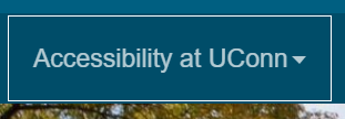
With hover: 
This is a problem for users who cannot see color, because they cannot see the color change. A quick fix is to add custom CSS for the :hover selector:
#dropdown-wrapper a:hover {
border-style:dotted!important;
border-width:1px;
border-color:rgba(255,255,255,0.7);
}
This adds a 1 pixel dotted border when the user hovers on the navigation button, adding visual focus:

However, some users do not have fine motor control to move the mouse and hover on a button. Instead, they use the tab key to progress through a page. In the default navigation, there is no indication other than color change that tab focus is on a navigation button with a sub-menu.
Without tab focus: 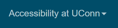
With tab focus:
A quick fix is to add a :focus selector:
#dropdown-wrapper a:focus {
color:rgba(255,255,255,1);
border-style:dotted!important;
border-width:1px;
border-color:rgba(255,255,255,0.7);
padding:14px
}
This adds a 1 pixel border around the navigation button when the user focuses via keyboard:
Putting it all together, in one block of code, produces the following snippet:
#dropdown-wrapper a:hover,.dropdown-wrapper a:focus {
color:rgba(255,255,255,1);
border-style:dotted!important;
border-width:1px;
border-color:rgba(255,255,255,0.7);
padding:14px
}