Headings are common in articles, papers, and web pages. Typically, headings will look different than paragraph text so that they stand out visually. We might bold, underline, or italicize text, or simply enlarge it for a heading. For sighted users, these headings are a way to skim through a page and quickly extract big ideas.
For screen reader users, however, visually distinguishing headings is not effective on its own. When we bold, underline, italicize, or otherwise manually recognize a heading, we are using what is called stylistic identification. This means that, while we may be visually identifying a heading, we are not programmatically identifying the heading. Screen reader users often use programmatically identified headings to easily navigate websites, skipping from heading to heading.
Most text editors, from Microsoft Word to Aurora’s content editor, feature predefined headings. You may notice options such as ‘Title’, ‘Heading 1’, and ‘Heading 2’. Using these heading styles changes your page’s code in a way that signals a screen reader that it has found a heading.
Heading styles in Aurora: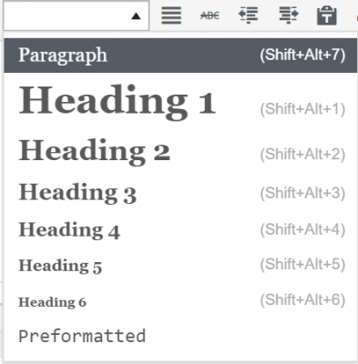
Heading styles in MS Word: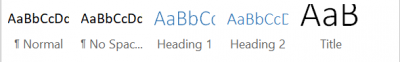
When using headings as your structure, it is important to remember not to skip heading levels. For example, if your page contains Heading 4, it should also contain headings 1, 2, and 3. Because screen reader users skip from heading to heading, omitting a heading can lead to unnecessarily lengthy navigation or fail to signal to the user the beginning of a new section or topic.
One challenge is identifying heading levels. If you have installed the Web Accessibility Toolbar (WAT) in Internet Explorer, you can select ‘Structure’ and then click on ‘Headings’ to identify heading levels in your page. In MS Word, you can simply select the text to determine the heading level.
A second challenge is ensuring no heading levels are skipped. Some widgets, like the accordions in Aurora, have predetermined headings. Accordions, for example, are always heading 4 (H4). This means that H1, H2, and H3 must all be present on the page as well.
Accordion example: ![]()
Typically, H1 will be the page header, and you might find H2 in other widget titles or in your footer. To use H3, you might consider styling the first sentence or main idea of your page. This visually sets off the idea while also signaling screen readers that this is the takeaway.
Example of using H3 to emphasize main ideas:
![]()
See H3 at work on this page! By formatting the first line as H3, we incorporate H1, H2, H3, and H4 throughout the page and make the headings identifiable for screen readers.