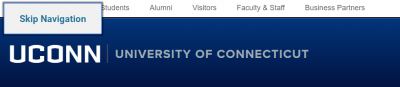
Broad Principles

Use the topics below to learn about common accessibility issues.

Hover and Focus

  •  Providing a visual representation of where a user is located on a page
    • No color dependence: Ensuring that the visual representation is not solely indicated by color change
    • Example: Giving a:hover and a:focus a border style attribute of dotted and border width of 1 pixel, with a border color that contrasts well with the background
    • Example: Showing that a user is located on an icon through the icon's movement; an icon might appear to float upward instead of changing color


Keyboard Access

  • Setting up a page so that a user can tab through all interactive elements on the page
    • This includes widgets
    • No information conveyed only through mouseover (title attribute): If a user cannot hover on an element, they will miss the information shown in the mouseover
    • All controls must be able to be accessed through the keyboard, typically through hitting 'tab'
    • Best practice: Minimize the number of times a user has to hit tab by grouping related objects under one a tag
      • Example: an icon and its text should be grouped together
    • Example: A user must be able to tab to an image carousel's controls

Skip Links

  • Allows users to bypass repetitive elements of a page
    • Just as sighted users visually skip over the navigation to a page's content, this allows non-sighted users or keyboard access users to do the same
    • Also called a "skip nav" because the navigation bar is often the repetitive element of the page
    • Best practice: Make it obvious that a skip link is present by having it visible when it receives tab focus
    • Example: Uconn.edu's skip link appears when it receives tab focus

skip link shown on UConn home page; text in skip link is Skip Navigation. Behind the skip link are navigation links, Students, Alumni, Visitors, Faculty & Staff, and Business Partners. UConn banner reads UCONN University of Connecticut

Color Contrast

  • Provides users with low vision or color blindness with perceivable content
    • Like color dependence, avoids providing information in a way that is not able to be apprehended by all users
    • If foreground to background color contrast is below 4.5:1, some users will miss information because they will not be able to differentiate between the foreground and background colors
    • Example: UConn's logo (white on UConn blue) has a foreground to background color contrast ratio of 14.46:1

UConn banner demonstrating high color contrast

  • For comparison, pure white (#FFF) on black (#000) has a perfect contrast ratio of 21.0:1

Last modified October 3, 2018