
View Code
/*======================Header/Masthead=======================*/
#site-title {
background-color:#004b98
}
#uc-site-parent a {
color:#fff!important
}
#uc-site-parent a:hover {
color:#fff!important
}
#nav-wrapper {
background-color:#003c79;
color:#fff!important
}
#masthead #site-title .col-sm-8 #uc-site-header #uc-site-parent a {
color:#ccc!important
}
#masthead #site-title .col-sm-8 #uc-site-header #uc-site-parent a:hover {
text-decoration:underline!important
}
h1#uc-site-title a {
color:#fff!important
}
h1#uc-site-title a:hover {
color:#fff!important;
text-decoration:underline!important
}
Solution:
Ensure that information is identified through more than just color. Examples include underlining links, boxing focused items, and cursor changes. If the issue is software-based, it may require changing software (for example, using a fully accessible media player instead of a player that uses only color to provide information).
Rationale:
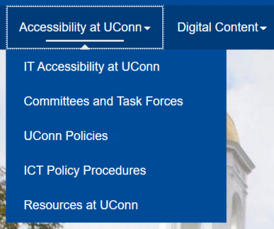
If a user cannot see color, it will be impossible to identify the function of information shown only in color. Information conveyed by color must also conveyed by an alternative method not dependent on color perception. In this solution, the page title is underlined on hover, a visual indicator other than color changing.
View Code
#dropdown-wrapper {
background-color:#003c79
}
#dropdown-wrapper a {
color:rgba(255,255,255,0.7)
}
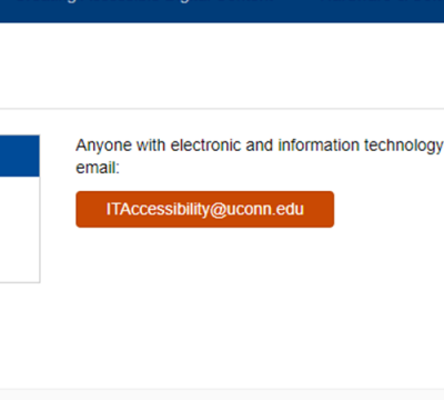
Solution:
Adjust contrast to be 4.5:1.
Rationale:
For users with low vision, this makes content perceivable. Text with 70% opacity or higher tends to have higher contrast against the background color while preserving the site’s overall design.
View Code
#dropdown-wrapper a:hover,.dropdown-wrapper a:focus {
color:rgba(255,255,255,1);
border-style:dotted!important;
border-width:1px;
border-color:rgba(255,255,255,0.7);
padding:14px
}
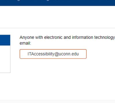
Solution:
Ensure that information is identified through more than just color. Examples include underlining links, boxing focused items, and cursor changes. If the issue is software-based, it may require changing software (for example, using a fully accessible media player instead of a player that uses only color to provide information).
Rationale:
If a user cannot see color, it will be impossible to identify the function of information shown only in color. Information conveyed by color must also conveyed by an alternative method not dependent on color perception. In this solution, both hover (using the mouse) and focus (using tab focus) place a border around the navigation item.
View Code
.navbar-collapse {
box-shadow:none
}
.navbar-form {
box-shadow:none
}
Solution:
Remove the box shadow from navigation.
Rationale:
Box shadows add visual distraction to a page, which can make it more difficult for users with visual impairments to navigate.
View Code
.dropdown-menu li a {
display:block;
padding:3px 20px;
clear:both;
font-weight:400;
line-height:1.42857;
color:rgba(0,0,0,0.6)!important;
white-space:nowrap
}
@media (max-width:767px) {
.dropdown-menu li a {
color:rgba(255,255,255,0.7)!important;
padding:14px!important
}
}
#masthead #nav-wrapper .navbar-collapse .nav > li:first-child > a {
padding:15px!important
}
#masthead #nav-wrapper .navbar-collapse .nav > li:first-child > a:hover {
padding:14px!important
}
@media(max-width:767px) {
#masthead #nav-wrapper .navbar-collapse a {
background-color:#004b98;
padding:14px!important
}
#masthead #nav-wrapper .navbar-collapse a:hover {
padding:13px!important
}
}
.dropdown-menu li a:hover,.dropdown-menu li a:focus {
background-color:#004b98;
color:#fff!important;
border-style:dotted!important;
border-width:1px;
border-color:rgba(255,255,255,0.7);
padding:9px 19px!important
}
Solution:
Ensure that information is identified through more than just color. Examples include underlining links, boxing focused items, and cursor changes. If the issue is software-based, it may require changing software (for example, using a fully accessible media player instead of a player that uses only color to provide information).
Rationale:
If a user cannot see color, it will be impossible to identify the function of information shown only in color. Information conveyed by color must also conveyed by an alternative method not dependent on color perception. In this solution, both hover (using the mouse) and focus (using tab focus) place a border around the sub-menu item.
View Code
#masthead #nav-wrapper .navbar-header .navbar-brand {
color:#fff!important
}
a.masthead-link {
font-size:16px;
position:relative;
top:25px;
opacity:.9;
color:#fff
}
.header-widget-area.col-sm-6 {
overflow:visible!important
}
a.masthead-link:hover {
color:#fff;
opacity:1
}
@media (max-width:997px) {
a.masthead-link {
margin-left:-20px
}
}
#dropdown-wrapper a:focus {
outline:1px solid #fff
}
/*--------------------------------Search Bar----------------------------*/
.home. widget_sp_image {
width:100%!important
}
.searchform input {
background-color:#fff!important;
color:#004b98!important;
border:1px solid #ccc!important
}
.searchform .btn.btn-default {
background-color:#003b50!important;
border:1px solid #eaeaea;
border-radius:0!important;
color:rgba(255,255,255,0.5)!important
}
.searchform fieldset {
border:0!important
}
#masthead #site-title .searchform fieldset .btn {
border:1px solid #003b50!important
}
#masthead .form-group .btn {
color:rgba(255,255,255,0.5)!important
}
i.glyphicon.glyphicon-search {
color:rgba(255,255,255,.7)
}
@media (max-width:767px) {
.searchform .btn.btn-default {
background-color:#a2a2a2!important;
border:2px solid #a2a2a2;
border-bottom:1px solid #a2a2a2
}
}
/*--------------------------- Meta Slider Styles------------------------------*/
.home .metaslider .caption-wrap {
position:absolute;
line-height:2.1em!important;
width:1200px;
margin-left:auto;
margin-right:auto;
right:0;
left:0;
bottom:50px;
background:transparent!important;
opacity:1!important
}
@media (max-width:1200px) {
.home .metaslider .caption-wrap {
width:991px;
top:18px
}
}
@media (max-width:991px) {
.home .metaslider .caption-wrap {
width:100%;
position:relative!important;
top:0
}
}
.metaslider .caption-wrap .caption {
width:48%;
background-color:rgba(43,55,60,0.8);
font-size:24px;
padding:30px!important;
color:#fff;
margin-left:30px;
line-height:1.5
}
h1.atuconn {
font-size:30px;
color:#fff;
margin-top:3px;
margin-bottom:15px
}
h2.hero-title {
color:#FFF;
font-size:35px;
margin-top:0
}
p.hero-subtitle {
color:#fff;
font-size:18px
}
.hero-text {
line-height:1.4;
font-size:22px
}
@media (max-width:1200px) {
.metaslider .caption-wrap .caption {
width:65%
}
}
@media (max-width:991px) {
.metaslider .caption-wrap .caption {
width:100%;
margin-left:0;
background-color:#004b98
}
}
#masthead #site-title .col-sm-8 #uc-site-header #uc-site-parent a:hover {
color:#bfd1de
}
/*---------------------------Home Styles-----------------------------*/
.home .entry-content {
margin:0!important
}
.home-text {
font-weight:400;
line-height:1.7;
color:#003c79;
font-size:18px
}
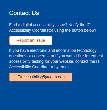
.btn-orange {
background-color:#C94903!important;
border-color:#B84303!important;
color:#FFF!important;
padding:5px 25px
}
Solution:
Adjust contrast to be 4.5:1.
Rationale:
For users with low vision, this makes content perceivable. In this solution, the color #C94903 has a compliant contrast ratio with the site’s backgrounds.
View Code
.btn-orange:hover {
background-color:#FFF!important;
color:#C94903!important
}
Solution:
Adjust contrast to be 4.5:1.
Rationale:
By using the same colors as in btn-orange, but reversing the background and text colors, the compliant contrast ratio is preserved while still demonstrating that the button receives focus.
View Code
a.btn.btn-orange {
padding:5px 25px!important
}
#footers a.btn-orange {
background-color:#fff!important;
color:#C94903!important;
border:1px solid #B84303!important
}
Solution:
Adjust contrast to be 4.5:1.
Rationale:
For users with low vision, this makes content perceivable. In this solution, the color #C94903 (used in btn-orange) does not have a compliant contrast ratio with the site’s footer. To be compliant, the footer button color is white, which has a high contrast ratio with the footer. To preserve the styling, the button border is the same color (#B84303) as other buttons, and the text color (#C94903) is the color of btn-orange.
View Code
a.btn.btn-orange {
padding:5px 25px!important
}
#footers a.btn-orange {
background-color:#fff!important;
color:#C94903!important;
border:1px solid #B84303!important
}
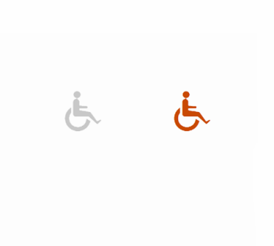
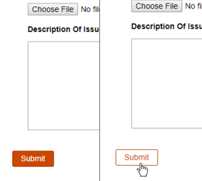
Solution:
Ensure that information is identified through more than just color. Examples include underlining links, boxing focused items, and cursor changes.
Rationale:
If a user cannot see color, it will be impossible to identify the function of information shown only in color. Information conveyed by color must also conveyed by an alternative method not dependent on color perception. In this solution, both hover (using the mouse) and focus (using tab focus) place a border around the button, in addition to changing its color. To preserve the contrast ratio, the text color changes to black (#000), and the button’s background color becomes a lighter shade of btn-orange’s color (#FFBE9A).
View Code
.glyphicon-row-column {
text-align:center
}
.glyphicon-row-column a {
text-decoration:none;
color:#545454!important
}
Solution:
Adjust contrast to be 4.5:1
Rationale:
For users with low vision, this makes content perceivable. In this solution, the text color (#545454) has a high contrast ratio against the background (#FAFAFA).
View Code
.glyphicon-row-column h3 {
color:#004b98;
font-size:25px
}
.glyphicon-row p {
font-size:16px
}
.glyphicon-row-column .glyphicons {
font-size:48px;
color:#C94903!important;
margin:15px 0 0;
transition:.5s margin ease
}
Solution:
Adjust contrast to be 4.5:1
Rationale:
For users with low vision, this makes content perceivable. In this case, the glyphicons are the same color as btn-orange (#C94903), which has a high color contrast.
View Code
.glyphicon-row-column:hover .glyphicons {
margin:0 0 15px
}
Solution:
Ensure that information is identified through more than just color. Examples include underlining links, boxing focused items, and cursor changes.
Rationale:
If a user cannot see color, it will be impossible to identify the function of information shown only in color. Information conveyed by color must also conveyed by an alternative method not dependent on color perception. In this case, the icon is animated to move up on hover, showing it is focused without depending on color alone.
Tab focus solution:
When tab focused, each icon and its accompanying text have a blue box around them. The text and icons are grouped so the user only has to hit tab once to move from item to item.
View Code
.featured-row h3.widget-title {
font-size:28px!important
}
.featured-row h3.widget-title::before {
font-family:"glyphicons regular";
content:"\e609";
color:#4d628c;
padding-right:20px;
font-size:30px
}
.featured-row h2.entry-title {
font-size:18px
}
/*---------------------------Interior styles--------------------------------*/
h1.entry-title {
color:#004b98!important
}
.interior-menu {
border:1px solid #ccc
}
.interior-menu li a {
padding:8px 10px;
margin-bottom:0!important;
text-decoration:none;
display:block;
color:#327CAF!important
}
.interior-menu li a:hover {
background-color:#004b98;
color:#fff!important
}
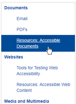
Solution:
Adjust contrast to be 4.5:1
Rationale:
For users with low vision, this makes content perceivable. In this solution, the text color (#545454) has a high contrast ratio against the background (#FAFAFA).
View Code
.interior-menu .active a {
color:#fff!important
}
.interior-menu .active a {
background-color:#004b98
}
.interior-menu .sub-menu * {
list-style-type:none!important
}
.interior-menu .sub-menu {
margin:0!important
}
.interior-menu .sub-menu li a {
padding-left:50px
}
.interior-menu li {
margin-bottom:0!important
}
.interior-menu .menu-item-has-children {
font-weight:600
}
.interior-menu .sub-menu {
font-weight:400
}
.gform_button {
background-color:#FF9019!important;
border:1px solid #ce6a00!important;
border-radius:3px;
color:#00364a!important;
padding:4px 15px
}
Solution:
Adjust contrast to be 4.5:1
Rationale:
For users with low vision, this makes content perceivable. In this solution, the color #C94903 has a compliant contrast ratio with the site’s backgrounds.
View Code
.gform_button:hover {
background-color:#fcb569!important
}
Solution:
Adjust contrast to be 4.5:1
Rationale:
By using the same colors as in btn-orange, but reversing the background and text colors on hover, the compliant contrast ratio is preserved while still demonstrating that the button receives focus.
View Code
aside#search,aside#meta {
display:none
}
/*------------------------------Footer------------------------------*/
#footers {
background-color:#004b98
}
#mega-footer p {
color:rgba(255,255,255,0.8)
}
#mega-footer p a:hover {
color:#fff!important
}
#mega-footer .widget a {
text-decoration:underline
}
#mega-footer .widget a:hover {
text-decoration:none
}
#mega-footer h2 {
color:#fff;
border-bottom:1px solid rgba(255,255,255,0.8);
padding:0 0 10px;
display:block
}
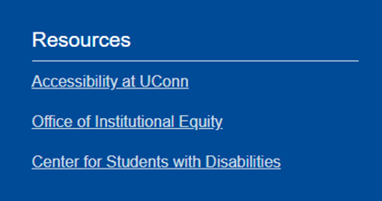
.footer-resources a {
display:block;
color:rgba(255,255,255,0.8)!important;
font-size:16px
}
Solution:
Adjust contrast to be 4.5:1
Rationale:
For users with low vision, this makes content perceivable. Text with 70% opacity or higher tends to have higher contrast against the background color while preserving the site’s overall design.
View Code
.footer-resources a:hover {
color:#fff!important
}
Solution:
Ensure that information is identified through more than just color. Examples include underlining links, boxing focused items, and cursor changes.
Rationale:
If a user cannot see color, it will be impossible to identify the function of information shown only in color. Information conveyed by color must also conveyed by an alternative method not dependent on color perception. In this case, the default underlined link text both changes color and loses its underline on hover.
View Code
/*-------------------accordion icons-------------------------*/
.accordion .panel-title a::after {
content:"\E601";
font-family:"glyphicons regular";
position:absolute;
right:75px;
color:#999;
transform:rotate(0deg);
transition:transform 180ms ease-in
}
.accordion .panel-title a.collapsed::after {
transition:transform 180ms ease-in;
transform:rotate(180deg)
}
@media (max-width:474px) {
.accordion h4.panel-title {
margin-right:30px!important
}
}
.accordion h4 a {
text-decoration:none
}
.home #content .panel-grid .widget a {
color:#0d69a9
}
a {
color:#0d69a9
}
.home #content .panel-grid .widget.widget_metaslider_widget {
margin:0;
margin-bottom:-10px
}
.pilot-element-links {
font-size:20px;
color:#4d628c
}
/*-------------------------------Featured Post---------------------------*/
.featured-post {
background-color:rgba(43,55,60,0.8);
padding:20px 20px 20px 30px;
margin-top:90px
}
.featured-post p {
margin:20px 0 10px
}
.featured-post h1 a {
text-decoration:none
}
.featured-post h1.entry-title a {
color:#fff!important;
font-size:30px;
font-weight:600
}
.featured-post h3.widget-title {
color:#fff!important;
font-size:14px!important;
margin-top:15px!important;
margin-left:15px;
margin-bottom:-5px;
text-transform:uppercase;
letter-spacing:1px
}
body.home.page-template-page-blank h3.widget-title {
margin-bottom:-5px!important
}
.featured-post .posted-on {
display:none!important
}
.featured-post article {
margin-bottom:0!important
}
.featured-post .cat-links {
display:none!important
}
.featured-post .entry-content {
color:#fff!important
}
.featured-post .entry-content a {
display:block;
border:1px solid #005F81;
background-color:#D2E1E6;
padding:8px 5px;
border-radius:5px;
width:150px;
color:#005F81!important;
margin-top:20px;
text-decoration:none;
text-align:center!important;
text-transform:capitalize
}
.featured-post .entry-content a:hover {
background-color:#fff;
text-decoration: underline
}
.featured-post .entry-content .meta-nav {
display:none!important
}
Solution:
Ensure that information is identified through more than just color. Examples include underlining links, boxing focused items, and cursor changes.
Rationale:
If a user cannot see color, it will be impossible to identify the function of information shown only in color. Information conveyed by color must also conveyed by an alternative method not dependent on color perception. In this case, the text is underlined on hover.
Last modified October 25, 2018