Your operating system and keyboard are what you will primarily use to determine your site's accessibility.
Optional tools that you may find helpful include screen readers, like NVDA. These can be used to clarify confusion about elements like tab order. Use the instructions and questions to evaluate your site or content's accessibility.
Audio
Instructions:
- Look through the page for audio.
- Do all audio files have a transcript or text description?
- Example: If an audio file is just sound effects, like lion roaring, there is textual description of the sound saying "Lion roaring"
Color Contrast
Instructions:
- Use Color Contrast Analyser to input a color's hex code
- Note: Open an image in Paint or Photoshop to determine a color's hex code with the eyedropper tool. If you are assessing a web page, take a screenshot and import the screenshot into Paint or Photoshop.
- Review the contrast ratio
- Is the color contrast ratio greater than 4.5:1?
- If the ratio is lower than 4.5:1, use Color Contrast Pal to determine a color combination that raises the ratio
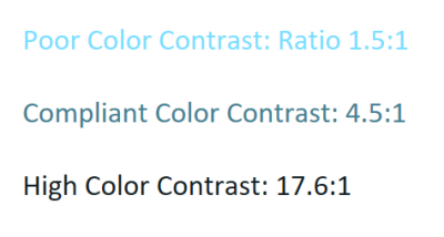
Examples of varying color contrast:

Color Dependence
Instructions:
- Look through the page for all places where color is used
- Example: Navigation bar, where color may be used to show hover or focus on a link
- Example: Links, where color may be used to show hover or focus on a link or to differentiate the link from other text
- Are there areas on the page where information is only provided by color?
- If the page was rendered in grayscale, is any color-based information lost?
Example of color dependence:

Example of focus shown in a way that is not color dependent:

Data Tables
Instructions:
- Look for any data tables on the page
- Are all row and column headers programmatically identified?
- Note: Cells would likely be programmatically identified by the program where the table was created.
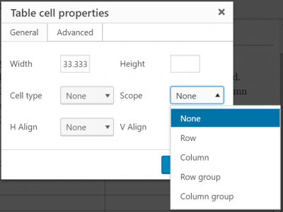
- If creating a table in Aurora, edit the Table Cell Properties and define the cell type as Header and the cell's scope as row or column

- If a complex data table is present, are its data cells programmatically associated with its headers?
- If creating a table in Aurora, edit the Table Cell Properties and define the cell type as Header and the cell's scope as row or column group
- Are there images of data tables?
- Note: An image of a data table will always be less accessible than the original table
Forms
Instructions:
- Look at each form field.
- Do all form fields have accompanying text with complete instructions and cues?
- Example: A form field asking for a user's first name might have text labeling it "First Name"
- Do all form controls identify their purposes?
- Example: A button labeled "Save and Close" indicates to the user that it will save the information and close the window
Frames
Instructions:
- Look through the page for all frames and iframes
- Note: YouTube embedded videos are iframes. Learn how to title YouTube iframes here.
- Note: YouTube embedded videos are iframes. Learn how to title YouTube iframes here.
- Is each frame's Title or Name descriptive?
- Is each iframe's Title or Name descriptive?
Images
Instructions:
- Find all the images on a page or in a document or presentation
- Does each image have alternate text (ALT)?
- Do all meaningful images (images designed to convey information to the user) have equivalent text that describe their purposes and functions?
- Do all decorative images (images not designed to convey information; "eye candy") have ALT = ""?
- Do all images containing text have the same text in the ALT?
- If there are CAPTCHA or reCAPTCHA images in the page, do they have an ALT describing their purpose? Is there an alternate way to access them?
- Do images have consistent meaning?
- Think: If there is an icon, like a magnifying glass, that means 'search' on one page, does it also mean 'search' when used on another page?
Links and User Controls
Instructions:
- Review all links on the page.
- Do all links have unique, meaningful names describing their destination or function?
- Example: "Learn more about web accessibility" instead of "Learn more"
- If a link reroutes to another page or site, does the link have a unique, meaningful name describing its destination?
- Example: "Read the rest of this article about web accessibility" instead of "Read more"
Multimedia
Instructions:
- Look for all multimedia (synchronized audio and visual) on the page
- For each piece of multimedia, ask the following questions
- Are synchronized captions provided?
- Are the provided captions accurate?
- If using auto-generated captions, ensure that captions have been edited for punctuation, speaker identification, etc.
Required Plug-ins
Instructions:
- Look at the page to determine if plugins are required to access any information
- Is the link to download a required plugin provided?
- Example: A page may have links to required plugins in the footer
- Is the plugin itself compliant?
- Note: You may have to review the plugin separately for accessibility
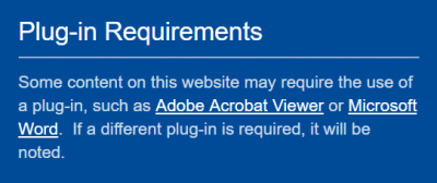
Example of plugins notice:

Section Headings
Instructions:
- Look through the page for headings
- Do the heading levels match the visual structure?
- Example: H1 will be the largest or most visually striking heading on the page, while H2 will be slightly smaller or more muted
Example of section headings:

Sensory Information
Instructions:
- Look through the page for all places where sensory components, such as shape, size, visual location, orientation, and sound are used to convey information
- Are instructions for understanding and operating content only provided using sensory information?
- If a user does not have access to a sense, will they still be able to understand and operate all elements of the page?
Video-only and Animation
Instructions:
- Look through the page for videos (without sound) or animations.
- Do all video-only files or animations have an equivalent text or audio description?
Keyboard Accessibility: Documents Only
Instructions:
- Tab through or use the arrow keys to navigate through the entire PDF, PowerPoint, or other presentation
- Note: This does not apply to Word documents or emails.
- Note: You may have to enter presentation mode to tab through a presentation.
- Is the tab order logical?
- If the tab order is not logical, use the selection pane or Reading Order tool to reorder elements of the page
- Refer to the PDF and PowerPoint pages for further information
Example of a keyboard trap (illogical tab order):
The video shows a user tabbing through a calendar application. The user becomes stuck within the calendar and cannot move on to other parts of the page.
Last modified May 22, 2019