When composing emails, there are a few steps that can be followed in order to make your content as accessible as possible.
Note: The following processes are for Microsoft Outlook 2016 and Office 365. If using another version, the process may be different.
Making an Email Accessible: Microsoft Outlook
-
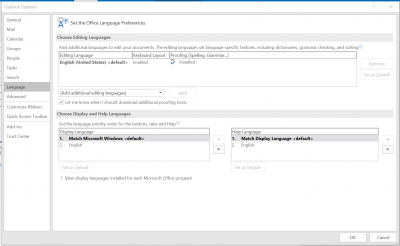
Under Review, select Language
- Click Language Preferences
- If the language of your email is other than the default (English), add additional editing languages and set the email's language
-
Use predefined heading styles instead of bold, italics, or underline to set apart headings
- In your email, under Format Text, select the heading level you would like your text to be
- Use heading styles to determine heading levels for your email
- Rule of thumb for headings: Typically, the bigger and bolder the heading is, the higher the heading level
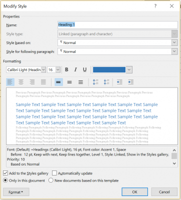
- Change the appearance of the heading style
- Choose the heading style you would like to change
- Right click on the heading style
- Click on modify
- Change the style and save
- Avoid hitting Enter or Return after a heading to create extra space after your heading
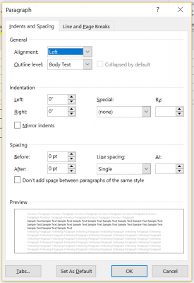
- Instead, highlight text after which you want the space
- Right click on the text
- Click Paragraph
- Increase the space after the paragraph
- Click OK
- Instead, highlight text after which you want the space
- To apply a heading style to all similarly styled text, click Select
- Choose Select all text with similar formatting
- Click on the desired heading
-
Set links in text as hyperlinks with meaningful link text
- Select text to be hyperlinked: Avoid “click here” and instead have text describe the link’s target
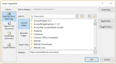
- Under Insert, select Links
- Click on Hyperlink
- Add the desired URL
-
Set ALTs (alternate text) for all images
- Ensure that all of your image alignments are set to In line with text
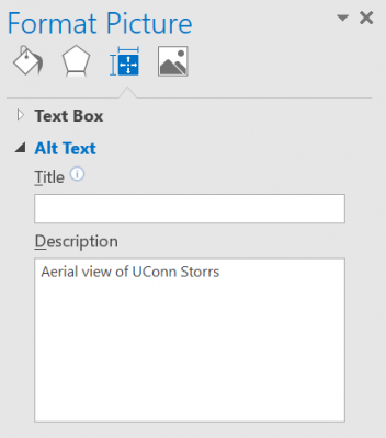
- Right click on any image in your email
- Under Format Picture, select Layout and Properties
- Enter your alternate text for the image in the Description box
-
Use an accessible font
- Fonts with serifs, like Times New Roman, can be difficult to read for people with low vision or learning disabilities
- Fonts like Arial and Calibri, sans serifs, are easier to read
- Use a font size of at least 11 pt.
-
Include transcripts or textual descriptions for all purely audio or purely visual media
-
Use only captioned multimedia
-
Check the document for color dependence
- Ask if the email uses color only to convey meaning
- Example of color dependence: "All red items are required"
- Example of no color dependence: "All red, bold items are required"
-
Check the document's color contrast using Color Contrast Analyser or Color Contrast Pal
- Contrast should meet a ratio of 4.5:1 (foreground: background colors)
- Adjust colors as necessary
-
Set table headers
- Click on the table
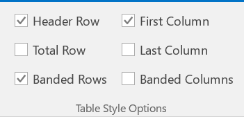
- Under Design, ensure that Header Row and/or First Column is checked
- Use Header Row if headings are over columns
- Use First Column if headings are by row
-
Use predefined lists
- Either before or after entering text, select the bulleted or numbered list icons
- This will produce a programmatically-defined list

Making an Email Accessible: Outlook Office 365
-
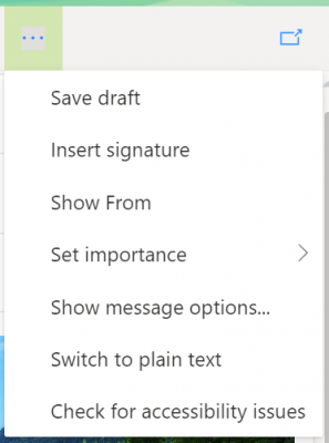
Next to Discard, click the 3 dots to show more email options
- Select Check for accessibility issues
- Follow prompts to make your email more accessible
-
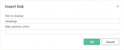
Set links in text as hyperlinks with meaningful link text
- Select text to be hyperlinked: Avoid “click here” and instead have text describe the link’s target
- Next to Quote ", click the 3 dots to show more email options
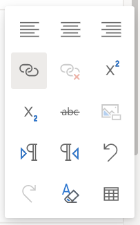
- Click on Hyperlink
- Add the desired URL
-
Set ALTs (alternate text) for all images
- Ensure that all of your image alignments are set to In line with text
- Right click on any image in your email
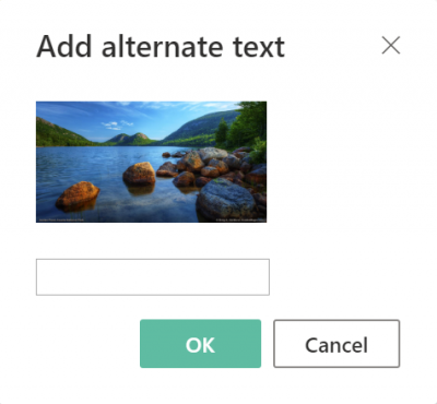
- Click Add alternate text
- Enter your alternate text in the box provided
-
Use an accessible font
- Fonts with serifs, like Times New Roman, can be difficult to read for people with low vision or learning disabilities
- Fonts like Arial and Calibri, sans serifs, are easier to read
- Use a font size of at least 11 pt.
-
Include transcripts or textual descriptions for all purely audio or purely visual media
-
Use only captioned multimedia
-
Check the document for color dependence
- Ask if the email uses color only to convey meaning
- Example of color dependence: "All red items are required"
- Example of no color dependence: "All red, bold items are required"
-
Check the document's color contrast using Color Contrast Analyser or Color Contrast Pal
- Contrast should meet a ratio of 4.5:1 (foreground: background colors)
- Adjust colors as necessary
-
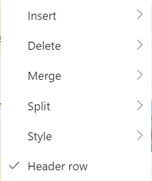
Set table headers
- Right click on the table
- Check off Header row
-
Use predefined lists
- Either before or after entering text, select the bulleted or numbered list icons
- This will produce a programmatically-defined list

Attachments
It is important for your email attachments to be accessible. Please visit the Documents, PDFs, PowerPoint, InDesign, and Media and Multimedia pages for more information on how to make attachments accessible.
Last modified September 18, 2019